Showing posts with label Print Project. Show all posts

Wednesday, 24 July 2013

Creating Prints

I tried out a few print techniques, such as painting dyes on the silk screen and then transferring it onto fabric, using stencils to create a shadow of the design, and also using string print to show the line.

Technique 1

Second print
This was the first time I tried out this technique, and it turned out well; it gives a soft petal look to the design. 
First, I painted my design onto a large silk screen using just the black brusho dyes and water (diluting it to the tone I wanted on parts). I found it a bit fiddly as I had to hold the screen whilst painting, as the dye would bleed in I laid it on the newspaper. I then laid the screen on the fabric and pulled clear wall paper paste across the design, which made it transfer onto the fabric. I managed to get two prints out of it, and it gave an odd mix of colours; the pigments of the black dye were separating, leaving some parts blue or orange/brown.

First print
I then tried giving one of the prints a background.
I used the first print because I thought the second one was a bit too light and therefore would be washed out by the dark colour I wanted to use. To do this technique, I cut out around a photo copy of the design and placed it over the print. I then put the silk screen over the top and pulled dyed wallpaper paste over the fabric. When I took the screen off, the stencil left the printed design unharmed and with a small white border.


Technique 2

Following the same technique of using a stencil to block the dyed wallpaper paste, I tried it out with a string print of the design.

I quite liked the negative space of the design, so I decided to just have a pint of that.


The string print was slightly larger than the stencil, as I wanted the stencil to be completely filled up and busy with lines.
I wanted to use pink as it contrasted against the blue and is a flowery colour.  
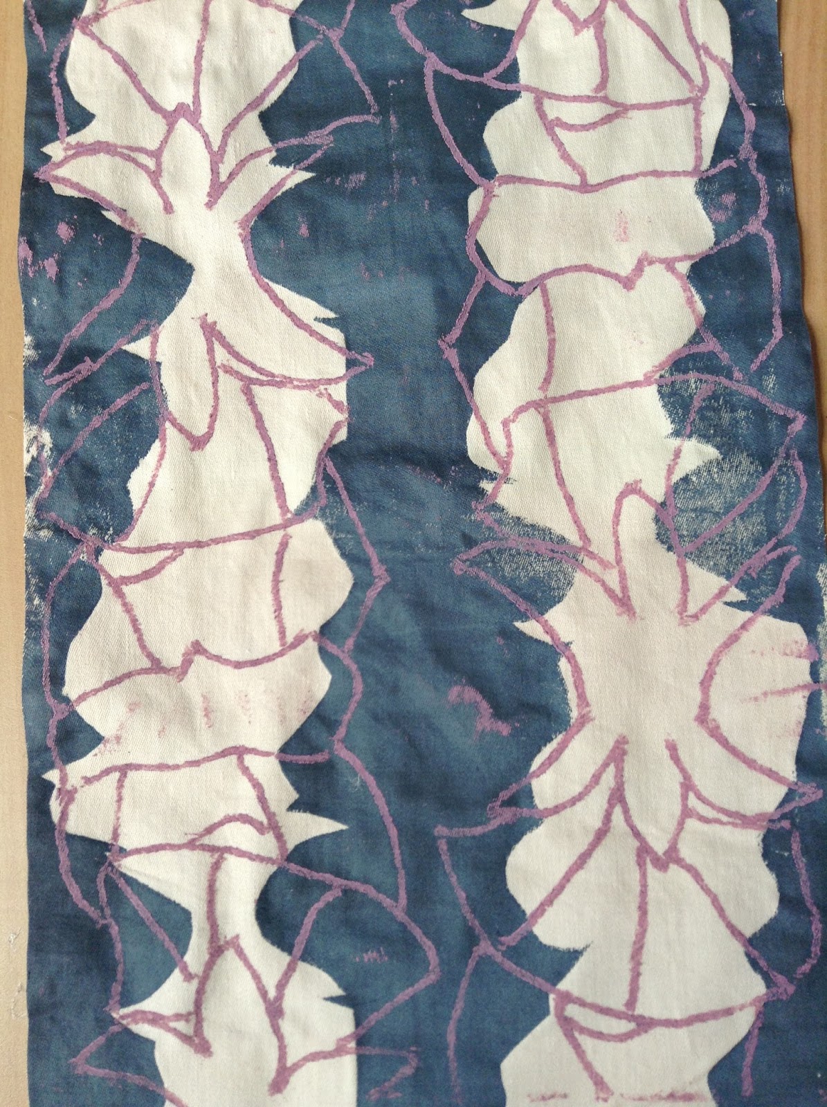

The print on the plain fabric worked out well and is my most favourite out of the samples.


I tried to work on already floral fabrics, but they turned out a bit rubbish; they are too busy and confusing.
I was just an idea of how I could overlap designs.


However, when I tried just the string print on plain fabric, it gave a more appealing busyness as it was just line.


Technique 3

I tried out my string print on papers to see what it would be like, but it came out a bit messy.
This could of been because the string print was getting old, there was old ink or too much ink on the string print, or paper doesn't except the ink very well.


Out of all these prints I found the first technique to be the most effective, as it had a more professional appearance.  
  • There was a range of tones showing light and dark, and texture.
  • Line was incorporated in the print.
  • It showed the delicateness of flowers.
  • It was clear that the design was based on a flower.

Monday, 22 July 2013

Creating Designs

After my three lessons of drawing plant life in different media's and views, my next stage was to create possible designs that could be developed into prints.

Plants from negative space studies

I decided to create traditional print designs first of just repeating a group of flowers by flipping them and making them stand out as individuals. Very simple.


However, I then decided to try out a more confusing style by fitting the flowers together, making it difficult for the viewer to make sense of it. 

Pansies from ink study

I much liked this design, and decided to explore it further by adding colour and tone.

I looked at both the natural colours of the pansies and the unnatural colours, to see which one suits the design I've created best. I like them both as the natural colour scheme gives the appearance of how the pansies are close together and that there isn't anything peculiar about them (when there is - fooling the eye), whereas the unnatural one fits the oddness about the design.


I also tried simplifying the design slightly by using block colours on the flowers showing different tones.


I could do a string print to capture the line and a stencil print to try and get the block colours from the simplified design.

Saturday, 20 July 2013

Floral Drawings: Lesson 3

For this lesson we explored drawing grouped flowers from pots large scale with inks.

I really enjoyed doing this task as I liked experimenting with the natural, vibrant colours of the pansies and also trying to capture the smooth, velvety texture of petals with the inks.

I managed to use up two A1 sized paper for this task. One of the sheets were used to show line, texture, tone and colour, whereas the other one was used to experiment with Japanese brushes and how I can show more movement and shape.

For the pansy sheet, I drew out the flowers first with black Indian ink and let it dry slightly before adding washed out ink on top. By not having the Indian ink dry properly I was able to create my tone in my studies of the flowers I saw. This worked well with the leaves.


 For the second sheet, I used washed out inks and Japanese brushes to create a more natural shape and movement of the flowers and their leaves, as the daisies leaves are sharp and pointed in different directions.

Thursday, 18 July 2013

Floral Drawings: Lesson 2

For this lesson we focused on the negative space. Again I was completely new to this, yet I really enjoyed the challenge of drawing the space around the flowers.

We started off with drawing around the shadows of the plants, getting the outlines and basic shapes. My favourite plant to draw from was the thistles, as they had a very complex and interesting shape: they look as though they are wilting, and also they have a very different appearance compared to the other plants I used.


Kaleidoscope
-Furnishing Fabric-
Mary Harper
Edinburgh Weavers
1960
I also drew around the shadows of flowers, which had a more softer edge. The poppies however, lacked a flower shape as they had been pressed making it more of an eye shape. This shows that using negative space can create confusion on what the object could be - hiding the identity of the object.

However, I did come across some interesting shapes, such as the pink flower: by holding it in different angles I was able to create a new flower. I also overlapped some of the studies which I thought gave a good effect as it started to look like a possible floral print. I could maybe use that section to create a
'Pevensy' - Liberty &Co -
Furnishing Fabric
1910
repeated pattern of some sort, like the Liberty & Co furnishing fabric.

I then started to fill in the negative space with pen. I first did one where I drew out the outlines of the plant and then started to fill the space in. This way worked well, however I then started to just fill the negative space with out an outline. By doing this, I was able to get a better effect of negative space as there wasn't an outline for me to follow so the petals of the daisies seemed more natural.


Tuesday, 16 July 2013

Floral Drawings: Lesson 1


We studied flowers and leaves in detail using pen and making fine lines, not including any tones. By doing this we were able to focus on the structure and line of the natural forms, which were shown to have their own personal characteristics.
 It was a very new way of drawing for me as I typically like to show a lot of tone in my drawings, but also by doing this technique I am able to show movement through mark making.

We were basing our drawings off a sheet we were given of straight-on sketches of flower heads. Even though my sketches are on the plant life from other angles, I followed how they had used a clear line to distinguish each petal and the flower shape as a whole.
I found it quite interesting drawing the daisy because of its full head of petals,  textured centre, and small jagged leaves that contrast against the smooth petals.

If I was to develop any of these sketches any further into a print I would probably either simplify them into string print, or I would use mono printing. String printing would help me achieve the unique shapes of the petals, but the flower would probably need to be enlarged if I want to get the jagged leaves. Mono printing on the other hand, would be best if I want the more finer detail, but the print wouldn't be so bold.


I could possibly overlap my drawings like

Mary Harper's furnishing prints for Edinburgh Weavers, and then use some sort of block coloured printing technique like silk screen to overlap colours and flowers. 
                    

Monday, 17 June 2013

Liberty of London

On our visit to London, we explored the old tudor building of Liberty, looking at the floral prints and designer garments.


There were many Tana Lawn fabric prints.
 Many of the prints are rather traditional and detailed in design, however there is a small range of more modern and simple designs.

The fabrics sold are at a high quality and are very expensive. Some of the fabrics there could both be sold as just fabric or part of a garment or interior.
Capel V Tana Lawn
For instance, some of the fabrics were used to decorate mannequins (boosting up the cost to around £2000).

The floral prints are all printed on Tana Lawn.
Tana Lawn is a traditional Liberty fabric created out of pure cotton and a very fine thread count.

Mirabelle B Tana Lawn 
The Capel V Tana Lawn print uses a very simple print design which uses a very small range of colours, and outline studies of flowers. The shape of the flowers are fairly accurate compared to the lack of colour and tone, however the centers of the flowers are rather simple.

The Mirabelle B Tana Lawn print in comparison to Capel V, is more vivid in colour and has a more simple modern approach to the layout of the design. However, the colour scheme is close to natural, keeping to a slightly traditional style.


In Liberty's, I had come across a print on a garment, which reminded me of the decoration on some of the clothing in the 'Tudors, Stuarts, and The Russian Tsars' exhibition; it is embellished with gold in a traditional royal style of a complex pattern.


This design uses small dotted marks which reminds me of seeds. It helps add to the busyness of the floral pattern, and show the movement and shape of the plant.

In contrast to Capel V, this design incorporates the blue background within the flower, whereas the Capel V print is filled in white with a different shade of purple for the outlines.

All three of these prints are very different in appearance, however, they all follow the design of having at least two types of flower and also include stems and leaves, achieving a more full look.