Technique 1
 |
| Second print |
This was the first time I tried out this technique, and it turned out well; it gives a soft petal look to the design.
First, I painted my design onto a large silk screen using just the black brusho dyes and water (diluting it to the tone I wanted on parts). I found it a bit fiddly as I had to hold the screen whilst painting, as the dye would bleed in I laid it on the newspaper. I then laid the screen on the fabric and pulled clear wall paper paste across the design, which made it transfer onto the fabric. I managed to get two prints out of it, and it gave an odd mix of colours; the pigments of the black dye were separating, leaving some parts blue or orange/brown.
 |
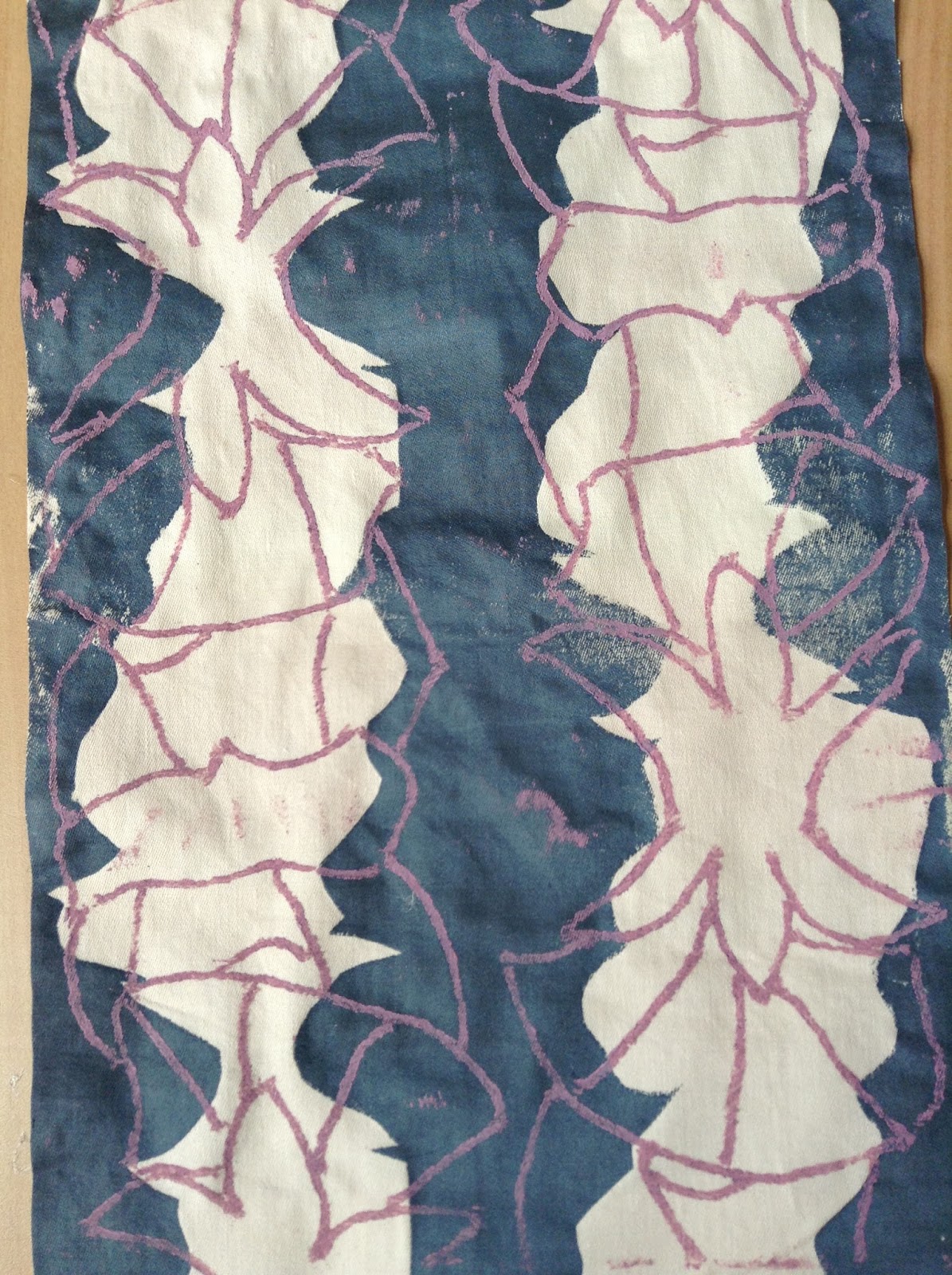
| First print |
I then tried giving one of the prints a background.
I used the first print because I thought the second one was a bit too light and therefore would be washed out by the dark colour I wanted to use. To do this technique, I cut out around a photo copy of the design and placed it over the print. I then put the silk screen over the top and pulled dyed wallpaper paste over the fabric. When I took the screen off, the stencil left the printed design unharmed and with a small white border.

Technique 2
Following the same technique of using a stencil to block the dyed wallpaper paste, I tried it out with a string print of the design.

I quite liked the negative space of the design, so I decided to just have a pint of that.

The string print was slightly larger than the stencil, as I wanted the stencil to be completely filled up and busy with lines.
I wanted to use pink as it contrasted against the blue and is a flowery colour.
The print on the plain fabric worked out well and is my most favourite out of the samples.

I tried to work on already floral fabrics, but they turned out a bit rubbish; they are too busy and confusing.
I was just an idea of how I could overlap designs.

However, when I tried just the string print on plain fabric, it gave a more appealing busyness as it was just line.

Technique 3
I tried out my string print on papers to see what it would be like, but it came out a bit messy.
This could of been because the string print was getting old, there was old ink or too much ink on the string print, or paper doesn't except the ink very well.


Out of all these prints I found the first technique to be the most effective, as it had a more professional appearance.
- There was a range of tones showing light and dark, and texture.
- Line was incorporated in the print.
- It showed the delicateness of flowers.
- It was clear that the design was based on a flower.
No comments:
Post a Comment