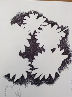
 For this lesson we focused on the negative space. Again I was completely new to this, yet I really enjoyed the challenge of drawing the space around the flowers.
 We started off with drawing around the shadows of the plants, getting the outlines and basic shapes. My favourite plant to draw from was the thistles, as they had a very complex and interesting shape: they look as though they are wilting, and also they have a very different appearance compared to the other plants I used.
 |
| Kaleidoscope -Furnishing Fabric- Mary Harper Edinburgh Weavers 1960 |
However, I did come across some interesting shapes, such as the pink flower: by holding it in different angles I was able to create a new flower. I also overlapped some of the studies which I thought gave a good effect as it started to look like a possible floral print. I could maybe use that section to create a
 |
| 'Pevensy' - Liberty &Co - Furnishing Fabric 1910 |
 I then started to fill in the negative space with pen. I first did one where I drew out the outlines of the plant and then started to fill the space in. This way worked well, however I then started to just fill the negative space with out an outline. By doing this, I was able to get a better effect of negative space as there wasn't an outline for me to follow so the petals of the daisies seemed more natural.
No comments:
Post a Comment