Tuesday, 30 July 2013

As You Like It

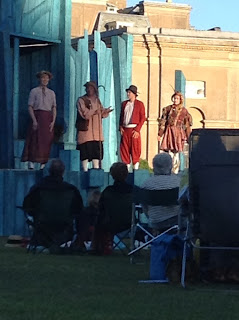
On Sunday, my dad and I went to see an all male cast, Shakespeare play called 'As You Like It'. It was performed by the all male troupe called The Lord Chamberlain's Men, at the National Trust park. It was a small outside play, however the atmosphere was still professional and well presented.
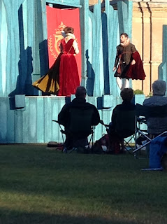
Rosalind with her uncle and cousin

The play is based on the heroine Rosalind who flees from being prosecuted by her uncle with her cousin Celia and the court jester, Touchstone. The male protagonist, Orlando, falls in love with Rosalind, but is forced to flee because of his brother trying to prosecute him. They all (but separately) head to the Forest of Arden where Rosalind disguises herself as a man called Ganymede with Celia disguised as her sister, Aliena. Through the story, Rosalind (as Ganymede) meets up with Orlando, and pretends to help cure him from being in love. The play includes love triangles and humour, which leads to a happy ending of Rosalind and Orlando, and two other couples getting married all at once.

This play links to the onnagata theatre of having an all male cast, but it also links to the traditional Shakespeare cast; back when Shakespeare was creating plays (1600s), women were not allowed to act so they used an all male cast to play both male and female roles.

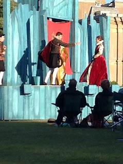
Rosalind meets Orlando
My main focus of watching this play, was to see the method of how costume is worn to play roles and show the characters personality .

Rosalind in red dressed as a man
I believe that the character Rosalind was an interesting character for showing personality and playing roles as it was a male actor playing as a woman who plays as a man. When the male actor plays as Rosalind (as herself), he creates a very feminine character who holds her hands to her chest and walks holding her dress like a woman from the time. Even when the actor needs to play as a woman playing as a man, he still portrayed the character being very feminine, as she squeals and faints. Costume plays an important role for this character as it represents the disguise of Rosalind becoming a man (making it more believable for the audience and other actors), and also the male actor disguising himself as Rosalind.This links to David Bowie and his inspiration to onnagata theatre, as Ziggy Stardust plays as both masculine and feminine. Colour is also used to show the audience that the character is Rosalind, as she is always dressed up in red. The red also suggests love, which reflects how her goal is to marry the man she loves. Also it shows love, as a female character falls in love with Ganymede.


Wealth is shown strongly though costume in this play; there is upper class characters with rich colour clothing made out of velvety material (similar to Queen Elizabeth I's dress in the Hampden Portrait), and then in contrast there is farmers, music travellers and peasants.

The uncle is dressed as an upper class man, which is shown through his collar and velvety red cloak. The actor also presents the characters personality through the way he stands: back straight, elbows out, fitting with the wealthy clothing and how it should be worn. It shows that the character has a high status of power, therefore the actor uses the wealthy-looking clothing to portray the role he is playing: being a powerful man.
Musician

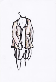
A musician in the play dresses differently to the uncle, as he travels around playing music to make money. So for this character, the actor dresses more relaxed and with earthy colours and has clothing which doesn't have a decoration purpose.
 The costume is raggedy and reflects how little money the musician earns. However the jacket is suitable for a traveller as it covers the man's torso making it purposeful to wear for the cold. The blouse under the jacket shows that he doesn't need or want to present himself like the upper-class people and tuck in his blouse. This suggests that the character is more down to earth and relaxed. This is even shown though how he acts towards others; he had his arms on his friends shoulders and insulted another character. The characters personality is also very cheery suiting the role of a travelling musician.
The cousin of Rosalind (Celia) dresses up as a poor, working girl as a disguise. She changes from a wealthy garment, which is made fittingly, to a shapeless blouse and skirt. The male actor for this character has to keep very feminine, as he plays as a woman throughout. The character dresses in shades of pinks, suggesting her girlishness and innocence, as she helps her cousin and gives her love advice.
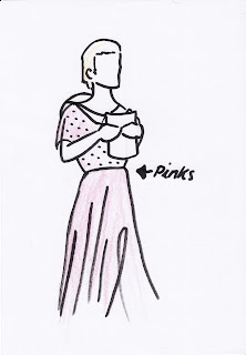
Again the male actor has to portray a woman by using his posture: very reserved and holds his hands together.
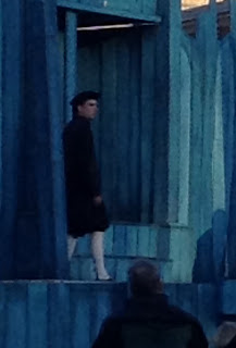


There was a minor character in the play who is also a traveller, however he has a sly, snobby personality, which is reflected though his clothing: neatly dressed like an upper class person (but not as fancy) and wears all dark clothing suggesting that he is bit of an antagonist.The actor uses the neat clothing to show how the character likes to show that he is better then everyone else; he walks elegantly with his head up.

 The jester in the play had a very mischievous, bubbly personality who isn't afraid to speak his mind. His costume is a typical jester outfit which fits the role. The actor portrays the character as being-a-laugh by jumping and skipping around the stage singing, suiting the jester appearance and stereotype.


The costume used bright(ish) colours that reflected the personality of the character. The design of the costume included tassels on the arms and legs and also a red, bull hat. This is to show that he is the fool and so the audience would recognise who he is and expect him to dance when they first see him.


From watching this play I was able to see the methods used by the actors through costumes to portray to the audience about the personality and roles of the characters.

I will hopefully go and see some more clothing from the Tudor era later in the summer holidays, and hopefully see the garments more up close as I was unable to do so when I watched this play (this was mainly of me focusing on how costume is used in performance).

Friday, 26 July 2013

Clothes I've Adjusted

Linking to my title of what methods are used in fashion to portray someone, I've decided to have a look at what I have done to my own clothes to make them more suited to me.

 The most typically adjusted clothing I have is shorts. This is because I never really buy shorts, as I find the ones I like to be a bit too expensive. So instead of buying them, I usually get and old pair of jeans at cut it at the length I want it.

Now, I can easily fold the bottom to make a neat edge, but however, I prefer frayed edges for some reason. This I suppose is because of my age and that it can be fashionable for frayed edged shorts. And usually to get the frayed edge it would take a few washes to get it like it is now.

I have been making my own shorts for years, and even though its not much of an adjustment, it is an essential part of my wardrobe, which I love to wear with a pair of patterned tights.

From drawing the shorts worn, I have learnt that they have lost a lot of shape. This was probably caused from the fabric being cut, washed several times, and worn a lot (even as a pair of jeans). However I still like to wear them. I suppose it's because I find them comfortable to wear; the material has become very soft. Or I enjoy wearing them as part of an outfit.

I don't really know what made me decided to cut my jeans up. Something to think about. 

Wednesday, 24 July 2013

Creating Prints

I tried out a few print techniques, such as painting dyes on the silk screen and then transferring it onto fabric, using stencils to create a shadow of the design, and also using string print to show the line.

Technique 1

Second print
This was the first time I tried out this technique, and it turned out well; it gives a soft petal look to the design. 
First, I painted my design onto a large silk screen using just the black brusho dyes and water (diluting it to the tone I wanted on parts). I found it a bit fiddly as I had to hold the screen whilst painting, as the dye would bleed in I laid it on the newspaper. I then laid the screen on the fabric and pulled clear wall paper paste across the design, which made it transfer onto the fabric. I managed to get two prints out of it, and it gave an odd mix of colours; the pigments of the black dye were separating, leaving some parts blue or orange/brown.

First print
I then tried giving one of the prints a background.
I used the first print because I thought the second one was a bit too light and therefore would be washed out by the dark colour I wanted to use. To do this technique, I cut out around a photo copy of the design and placed it over the print. I then put the silk screen over the top and pulled dyed wallpaper paste over the fabric. When I took the screen off, the stencil left the printed design unharmed and with a small white border.


Technique 2

Following the same technique of using a stencil to block the dyed wallpaper paste, I tried it out with a string print of the design.

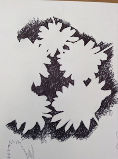
I quite liked the negative space of the design, so I decided to just have a pint of that.


The string print was slightly larger than the stencil, as I wanted the stencil to be completely filled up and busy with lines.
I wanted to use pink as it contrasted against the blue and is a flowery colour.  


The print on the plain fabric worked out well and is my most favourite out of the samples.


I tried to work on already floral fabrics, but they turned out a bit rubbish; they are too busy and confusing.
I was just an idea of how I could overlap designs.


However, when I tried just the string print on plain fabric, it gave a more appealing busyness as it was just line.


Technique 3

I tried out my string print on papers to see what it would be like, but it came out a bit messy.
This could of been because the string print was getting old, there was old ink or too much ink on the string print, or paper doesn't except the ink very well.


Out of all these prints I found the first technique to be the most effective, as it had a more professional appearance.  
  • There was a range of tones showing light and dark, and texture.
  • Line was incorporated in the print.
  • It showed the delicateness of flowers.
  • It was clear that the design was based on a flower.

Monday, 22 July 2013

Creating Designs

After my three lessons of drawing plant life in different media's and views, my next stage was to create possible designs that could be developed into prints.

Plants from negative space studies

I decided to create traditional print designs first of just repeating a group of flowers by flipping them and making them stand out as individuals. Very simple.


However, I then decided to try out a more confusing style by fitting the flowers together, making it difficult for the viewer to make sense of it. 

Pansies from ink study

I much liked this design, and decided to explore it further by adding colour and tone.

I looked at both the natural colours of the pansies and the unnatural colours, to see which one suits the design I've created best. I like them both as the natural colour scheme gives the appearance of how the pansies are close together and that there isn't anything peculiar about them (when there is - fooling the eye), whereas the unnatural one fits the oddness about the design.


I also tried simplifying the design slightly by using block colours on the flowers showing different tones.


I could do a string print to capture the line and a stencil print to try and get the block colours from the simplified design.

Saturday, 20 July 2013

Floral Drawings: Lesson 3

For this lesson we explored drawing grouped flowers from pots large scale with inks.

I really enjoyed doing this task as I liked experimenting with the natural, vibrant colours of the pansies and also trying to capture the smooth, velvety texture of petals with the inks.

I managed to use up two A1 sized paper for this task. One of the sheets were used to show line, texture, tone and colour, whereas the other one was used to experiment with Japanese brushes and how I can show more movement and shape.

For the pansy sheet, I drew out the flowers first with black Indian ink and let it dry slightly before adding washed out ink on top. By not having the Indian ink dry properly I was able to create my tone in my studies of the flowers I saw. This worked well with the leaves.


 For the second sheet, I used washed out inks and Japanese brushes to create a more natural shape and movement of the flowers and their leaves, as the daisies leaves are sharp and pointed in different directions.

Thursday, 18 July 2013

Floral Drawings: Lesson 2

For this lesson we focused on the negative space. Again I was completely new to this, yet I really enjoyed the challenge of drawing the space around the flowers.

We started off with drawing around the shadows of the plants, getting the outlines and basic shapes. My favourite plant to draw from was the thistles, as they had a very complex and interesting shape: they look as though they are wilting, and also they have a very different appearance compared to the other plants I used.


Kaleidoscope
-Furnishing Fabric-
Mary Harper
Edinburgh Weavers
1960
I also drew around the shadows of flowers, which had a more softer edge. The poppies however, lacked a flower shape as they had been pressed making it more of an eye shape. This shows that using negative space can create confusion on what the object could be - hiding the identity of the object.

However, I did come across some interesting shapes, such as the pink flower: by holding it in different angles I was able to create a new flower. I also overlapped some of the studies which I thought gave a good effect as it started to look like a possible floral print. I could maybe use that section to create a
'Pevensy' - Liberty &Co -
Furnishing Fabric
1910
repeated pattern of some sort, like the Liberty & Co furnishing fabric.

I then started to fill in the negative space with pen. I first did one where I drew out the outlines of the plant and then started to fill the space in. This way worked well, however I then started to just fill the negative space with out an outline. By doing this, I was able to get a better effect of negative space as there wasn't an outline for me to follow so the petals of the daisies seemed more natural.


Tuesday, 16 July 2013

Floral Drawings: Lesson 1


We studied flowers and leaves in detail using pen and making fine lines, not including any tones. By doing this we were able to focus on the structure and line of the natural forms, which were shown to have their own personal characteristics.
 It was a very new way of drawing for me as I typically like to show a lot of tone in my drawings, but also by doing this technique I am able to show movement through mark making.

We were basing our drawings off a sheet we were given of straight-on sketches of flower heads. Even though my sketches are on the plant life from other angles, I followed how they had used a clear line to distinguish each petal and the flower shape as a whole.
I found it quite interesting drawing the daisy because of its full head of petals,  textured centre, and small jagged leaves that contrast against the smooth petals.

If I was to develop any of these sketches any further into a print I would probably either simplify them into string print, or I would use mono printing. String printing would help me achieve the unique shapes of the petals, but the flower would probably need to be enlarged if I want to get the jagged leaves. Mono printing on the other hand, would be best if I want the more finer detail, but the print wouldn't be so bold.


I could possibly overlap my drawings like

Mary Harper's furnishing prints for Edinburgh Weavers, and then use some sort of block coloured printing technique like silk screen to overlap colours and flowers.